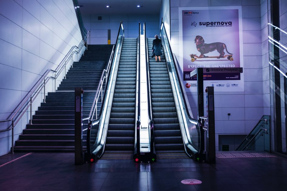
Also known as Digital Out of Home Advertising (DOOH), according to a technical SEO audit service I was speaking to recently, digital signage is a display that utilises technology like LED, LCD, e-paper, and projection. It functions as a means to exhibit various types of media like videos, images, and text and often is used as a channel to advertise, entertain, inform, and merchandise.
Digital outdoor ads are typically located at public places and areas with high volume of passers-by including retail stores, transportation systems, corporate buildings, hotels, and restaurants.
The Four Components of Digital Signage
Digital signage is built around four key components, which are:
- Software. A software, such as a Content Management System or CMS, is a digital channel in which content is placed and is then placed onto a display. It usually varies in capability and cost. For instance, some CMS can only run a limited type of media while others can exhibit an array of content. And although some are free to use, users usually need to pay a monthly or a yearly subscription as well.
- Hardware. Simply put, these are the physical elements of digital outdoor ads. They include a media player, display, and wall mounts.
- Content. This is the media to show on display. It usually includes but not limited to images, videos, texts, web pages, weather data, and, calendar.
- Strategy. A strategy is a well-thought content and distribution plan, created explicitly to ensure that a project will succeed and target the right people at the right time.
Best Practices to Digital Signage Making
Creating digital signage is not as straightforward as you think. It is, like any other marketing material, a meticulous and demanding task. On a lighter note, several methods can help you to lessen the difficulty as well as to optimise the signage.
In this article, you will learn the best practices every digital marketer needs to build attention-grabbing outdoor signage.
Setting a Goal
A well-thought out plan is crucial to the success of any digital signage campaign. It will serve as a guide and will allow you to see clearly what your goals and purpose are. Here are a few questions to help you begin:
- What do you want to achieve?
To have a clear understanding of how your digital signage is supposed to be, it is essential to know what exactly your goals are. It will also allow you to see other requirements you need to execute the plan successfully. The material’s purpose will aid you as well to identify several aspects that need to be considered. Say, if it is to catch the attention of employees, the display’s location should be where the target audience usually is. Otherwise, you won’t be able to reach your market.
- Who is your target market?
Once you’ve figured out what it is you want to achieve for the ad, learn who your target customers are next. Have a clear idea about their purchasing behavior, habits, and interests. To do that, try to write a User Persona. This way, you can tailor your content on what will catch their attention.
Accessible Design
Electronic and information technology— including digital signage— should take into account people with disabilities and so should have accessibility at their heart.
There is some great advice on the UK Gov site, but in the meantime, here are a few things to take note of:
- Text. All text must be large enough to see and understandable enough to read even from a reasonable range. To do that, choose a font and a size that will resonate the said standards and try reading it from different distances.
- Displays. From a wall and into a travel path, displays are not allowed to extend beyond 4 inches deep. This rule applies to any object. Hence, make sure that your display is precisely 4 inches or less.
Comprehensible Copy
An understandable and readable copy is what most customers prefer to see. Aside from it being easy on the eyes, it is not too difficult to understand as well. As such, creating simpler designs are much more efficient than fancy copies.
Here are a few essential rules to follow:
- Large fonts are better
- Use two fonts only
- Italicise responsibly
- Keep the copy short and concise
- Use Sans-Serif fonts
The Viewing Pattern
- Point of Wait. This type of interaction typically happens in places where people often wait. It includes elevators, service desks, and lobbies. For that reason, it allows for a more extended period of viewing time and is ideal for informative and engaging content.
- Point of Transit. Signage located in areas with a high volume of traffic is called Point of Transit. It is where folks walk from Destination A to Destination B and will be likely to have a glimpse of various displays. As such, it is ideal for event announcements and call-to-actions ads. It is wise to create short (preferably five words or less) and brief messages to maximise the situation further as well.
- Point of Sale. Typically, digital outdoor ads that are placed in a point of sale have longer viewing time compared to others. As such, it is an excellent means to persuade your target market to buy your goods. It is usually used as an in-store promotion, discount or sales, menus, and cross-selling.
Conclusion
While signs and billboards still play a significant role, digital outdoor advertising is gaining popularity at high speeds. In fact, a report published in Reuters states that the digital signage market is set to increase its compound annual growth rate at 7.28% from 2018 to 2023.
As such, together with other digital and traditional marketing techniques, adding digital signage into your marketing strategy could help you elevate your brand visibility and promote your business.

Recent Comments